Sunday, April 26, 2009

Hats of the World


This is the reason I haven't done the Illu Friday of last week. This is a project for illustration. We were to pick 6 countries and use their national colors to make a image that represented them. We were not to use figures or people at all. They were all supposed to be related by content and medium. I chose HATS! This was alot of fun. Oh yeah, and the 2 extras were to be our own made-up countries so I did a kids country and a pirate country by the names of Cannoli and Decatur. :-P
I chose to complete them using a really fun, exciting, scary, time-consuming technique I learned in highschool. You paint your image using white permanent gaouche or expensive temperas and leave all the lines you've drawn unpainted so the bare paper is exposed. After you let it dry for at least a day's time, you then do the scary part.... you cover the whole drawing with India Ink. Then you let it dry for another day. After that you gently rub your fingers over the drawing while running the paper under water. The magic is the ink comes off where you painted and stays where you didn't! You are left with a really cool, rustic-looking painting that closely resembles some printmaking projects.
Anyway. I am happy with it.
Wednesday, April 22, 2009

Colored pencil assignment done

not very happy with it. but its due at 8am and I need sleep

color figure studies

In my 8am illustration class today we did color figure studies.
It was fun to play with paint and get 3 different distinct characters from one model.

Tuesday, April 21, 2009

Colored pencil assignment


the progress on my colored pencil drawing for my drawing III class.
I am finally starting to like it. I have never drawn this way before with colored pencils and it has proven to be tough. I prefer crayola over the prismacolors our teacher required for the project. :-P

Sunday, April 19, 2009

illu proj 3


So I've begun my 3rd ILLU project. We are to pick 6 countries and use their national colors to create a picture that represents each country.
Then we are to make up two countries and make them go along with the theme of the rest.
I chose to do hats of different countries.
This is the experimentation with the pirate hat for my first made-up country.
I tried a watercolor wax resist. I tried a tissue paper painting. Then I tried a india ink, tempera resist which I liked best. It still needs working on but just posting the process.

Tuesday, April 14, 2009

Week Nine- "Fleeting"


I guess this isn't really a good interpretation of the word. I was a little confused by the meaning.
A new technique my teacher demonstrated... Black ink as a base then white acrylic as highlights then I thought it'd be cool to buy metallic pigment to mix in to make him even more reflective. I also used pen and white gel pen.

Thursday, April 9, 2009

Week Eight-"Talisman"

Mixed mixed mixed media.
I carved linoleum for a print but never got a chance to take it to the print shop so I used acrylic paint which didn't work so well to I hand-colored it with watercolor, colored pencils, and ink.

Wednesday, April 8, 2009

finished?


I am not too happy with it but I can't work on it anymore. I am tired of looking at it. it's midnight and its due at 8 in the morning.

Sunday, April 5, 2009

running into trouble


because our professor made us blacken some areas first, I am having a lot of trouble. I wanted to represent the least in focus areas as outlines but I can't get those parts of the paper white again. Ugh!

Saturday, April 4, 2009

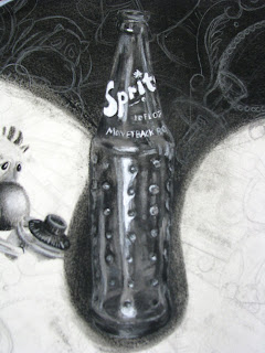
Tedious Drawing III assignment


Small portions of a very large, very scary 22 by 30 inch paper.
It is an interesting assignment. Professor wanted us to divide our paper into 5 fractions and leave 3 of those with white backgrounds and two filled in with compressed charcoal. I am still unsure why she asked us to do this.
Then she asked us to choose 5-7 objects to repeat across the page... filling the whole page. Now we are to create a composition with this load of junk already drawn by making some areas in focus and some out of focus.
I chose an asymmetrical X composition. This means that the crossing of the X will be my main focal point. This will be the bottle and a few parts around it.
Then the lines of the X get less and less focused as they get further from the bottle. The areas between the X lines will do the opposite. I posted the diagram if you're interested. I thought it was an interesting concept. The numbers represent how in focus each section is. 1 is the most in focus and 10 is the least in focus.

Thursday, April 2, 2009

My First Illustration Assignment


Our professor gave us a list of characters- example: nurse, bartender, bishop, astronaut etc...
And a list of emotions- Example: lecherous, frightened, ashamed, disgusted, etc...
He asked us the design 12 characters by mixing and matching the different professions and emotions. He wanted 6 of the 12 to be drawn from behind so we would leran to show an emotion without showing a face.
He then asked us to pick 3 of our 12 to put into a "movie set" together.
He printed out 8 scenes and flipped them over. One by one, the class chose a scene at random. I got a subway scene. This is what resulted from the madness.
I wish he would've allowed us to use color.